The Real Math Behind Slot RTP (And Why It Matters)
November 02, 2026 - iGaming


November 02, 2026 - iGaming

October 24, 2026 - iGaming
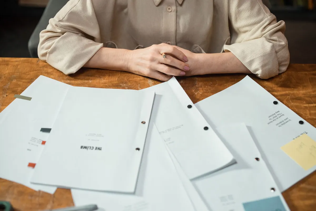
You have finished the novel. That is the hard part. Now the manuscript needs to look as though you know what you are doing before anyone reads a single sentence of it. Most UK independent presses read their own submissions, and often the editor who acquires your book is the editor who will work on it with you. A clean, predictable file earns goodwill long before your first paragraph does any work. Formatting is not creativity. It is manners, and it is easy to get right.
Set your document up before you write chapter one, not after. Retrofitting formatting into a 90,000-word file is a miserable afternoon involving a lot of shouting at Word.
Use your word processor's paragraph tools to set indents. Never space-bar or tab your way across a page: those gaps behave differently in every program that opens the file, and some of them turn into spectacular messes. If you are starting from a blank document, set these options in the styles menu and save the file as a template. It takes ten minutes once and saves you from repeating the same corrections on every new chapter.
Your title page carries practical information, not design flourishes. Put the title about a third of the way down, then:
A sample title page might look like this:
The Salt House
a novel by Eleanor Whitfield
Literary fiction / 92,000 words
+44 7700 900000
12 Harbour Lane, Bristol BS1 4XX
That is all the editor needs. On every page after that, run a header: your surname and a short version of the title in the top left, page number in the top right. Something like Whitfield / The Salt House / 47. Keep it plain, and avoid "Page 1 of 412" — nobody needs reminding how long the book is.
Set the header to appear on all pages except the title page, and check that page numbering begins at 1 on your first chapter, not on the title page. Most word processors call this "different first page". It is a small detail, but it makes your manuscript feel professionally assembled.
Be honest about the word count. Rounding 68,400 up to 70,000 is fine; claiming 90,000 is not. As a rough guide, literary and commercial adult fiction usually sits somewhere between 70,000 and 100,000 words, and young adult novels are often shorter. If your book falls well outside the usual range for its shelf, say so in your covering email rather than hoping nobody counts.
Start every chapter on a fresh page. "Chapter One" or "Chapter 1" — choose one and use it consistently, and do not dress the heading in bold, underline or a bigger font. Plain text at body size, set a few lines down the page, is what editors expect. If you use "Chapter One", do not switch to "1" halfway through. If you use Part One, make sure the parts are balanced and clearly signposted.
For a scene break inside a chapter, use a single centred hash (#) or three spaced asterisks. Use the same marker every time, and use a marker rather than an extra blank line. Blank lines can vanish at the top or bottom of a page, leaving two scenes bleeding into one another.
Dialogue follows a few simple conventions:
Long speeches can be broken by action beats, but keep the paragraph breaks logical. If a character continues speaking after an action beat, no new quotation marks are needed until they stop. For example: "I told you," she said, "that the door was locked." The punctuation stays inside the speech, and the reader always knows who is talking.
Use italics for emphasis, for titles of other works, and for a character's unspoken thought if that is your convention — never underline, never block capitals. If every other sentence is italicised, the emphasis stops meaning anything. Use it sparingly, and let the words do the work.
Use curly quotation marks and apostrophes if your word processor does it automatically, but do not mix straight and curly marks in the same file. Choose en dashes or em dashes and be consistent: an en dash with spaces – like this – is common in UK publishing, while a closed em dash—like this—is more American. Neither is wrong, but switching between them looks careless.
Numbers can trip you up, too. Most UK publishers spell out numbers from one to ten in prose and use numerals for 11 and above, unless the number begins a sentence. Dates are usually written as 12 March 2024, not March 12, 2024. Measurements follow the metric system in UK non-fiction, though fiction can use whatever fits the setting as long as it is consistent.
If you are submitting to a UK independent press, assume UK spelling unless the publisher tells you otherwise. That means colour, favour, realise, organise, travelled, centre, defence. If your narrator is American or the novel is set in the US, you may have a reason to use US spelling, but the choice should be deliberate and consistent. Do not let a spellchecker change half the book and leave the other half alone.
Consistency matters more than any single rule. Decide early whether you are using the Oxford comma, whether you write "towards" or "toward", and how you format text messages, letters and newspaper headlines. Then apply those decisions throughout. An editor would rather see a consistent house style of your own than a random mix of British and American conventions.
Most UK independent presses ask for a Word document (.doc or .docx) or an RTF file. Send exactly what they ask for. Do not send a PDF unless the guidelines specifically request one, because editors often need to add comments and track changes. Do not send a Google Docs link that requires permission, and do not send a Pages file that only opens on a Mac.
Name your file clearly: Surname_Title_Full Manuscript.docx is a common and safe format. Avoid final_final_v3_actual.docx. If the press asks for a synopsis and covering letter, send them as separate files with equally clear names, or paste them into the body of your email if that is what the guidelines say.
Before you attach anything, open the file on another device if you can. Check that the font, margins, indents, headers and page numbers have survived. Word documents are usually reliable, but any file can shift between versions. A quick look on a phone or a different computer can catch a disaster before an editor does.
Formatting will not make a weak novel publishable. But it will make a strong novel easier to read, easier to edit and easier to say yes to. Get the mechanics right, then forget them. The only thing that should surprise an editor is your prose.
Photo: Ron Lach / Pexels
Ask ten slot players what RTP means and you'll get ten different answers, most of them wrong. The number gets thrown...
You've probably seen the term plastered across casino lobbies: high volatility . It sounds exciting. It sounds like...
November 02, 2026 - iGaming
October 24, 2026 - iGaming
Copyright © 2026 Tide Press. All Right Reserved.