The Real Math Behind Slot RTP (And Why It Matters)
November 02, 2026 - iGaming


November 02, 2026 - iGaming

October 24, 2026 - iGaming
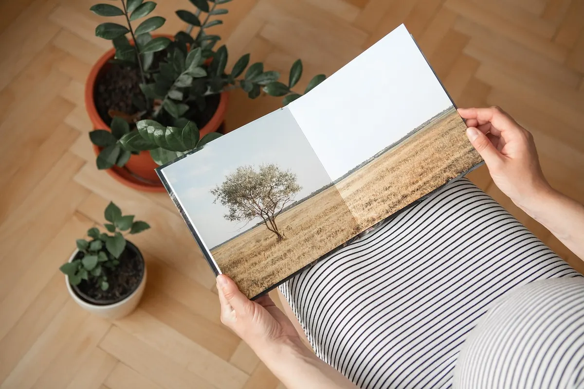
An art book is judged in the hand before it is read. Readers notice the weight of the paper, the way a page turns, whether a deep blue looks like the deep blue in the painting. Two decisions shape almost all of that: the stock you print on, and how carefully you check the colour before the presses roll. Get them right and a modest budget produces something genuinely handsome. Get them wrong and you can spend a great deal of money on a book that never quite resembles the artwork it was meant to reproduce.
The awkward part is that most of these decisions get made on screen. A spread is approved on a bright monitor, the printer runs the job, and the finished book arrives with a pale grey wash that has turned faintly green and a red that has gone flat and muddy. None of this is mysterious. It comes down to understanding what paper does to ink, and proofing in a way that reflects the final object rather than a glowing rectangle.
Before you look at swatch books, spend an hour with the images. Are they dense photographs with deep shadows, or watercolours where the paper texture is part of the work? Fine line drawings and subtle tonal gradation need a smooth surface. Heavily textured paintings, charcoal and monoprints often reproduce better on a stock that has some tooth of its own, because a glossy sheet can make them look thin and synthetic.
Pick the two or three hardest images in the book — the ones with the most delicate highlights and the densest blacks — and treat those as your benchmark. If they survive, everything else will.
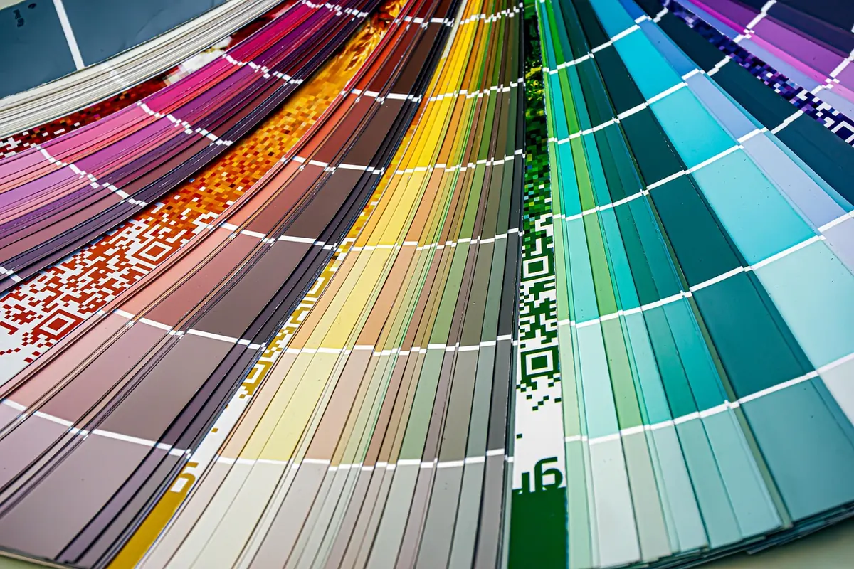
Paper is described by weight (grammage, in gsm), bulk, opacity and finish. For art book text pages, coated stocks in the 130–170gsm range are common; covers usually sit around 300–350gsm. Weight alone tells you less than you might expect. A lighter sheet with high bulk can feel fatter and more substantial in the hand, and opacity matters far more than weight when you are printing image-heavy pages back to back.
Ask your printer for dummy sheets or a bound sample book with your own images printed on it. A stock that looks beautiful blank can flatten an entire portfolio.
Paper is never neutral. Some sheets are brightened with optical brighteners and read cool and blue; others are cream or oatmeal. That base tint shifts every colour printed on it. Warm tones on a cool blue-white stock can look grey and tired. Skin tones on a creamy sheet can turn yellow. If colour accuracy is the point of the book, choose a neutral stock and check how it looks under daylight, not just office fluorescents.
A contract proof made to a recognised standard such as ISO 12647 or a FOGRA profile is your best estimate of the final result, and it is the document you sign off against. A digital proof simulates the printed sheet; a press proof is the real thing, but it is expensive and schedules rarely make it easy. Soft proofing on a properly calibrated monitor is useful for spotting gross errors, never for final approval.
The one rule worth keeping: a proof is only meaningful if it is made on, or accurately simulates, the exact stock you have chosen. A proof on glossy coated paper tells you almost nothing about how the same file will behave on uncoated.
Bring your printer in early, before the design is fixed. Tell them the budget, the intended print run and the level of colour accuracy you need. Ask which house profile they work to, what their ink limits are, and whether they would recommend a different stock for the price. A good printer will talk you out of an expensive mistake; a bad one will simply take the order.
For limited editions, facsimile work or books where the reproduction is the product, the fee for a specialist repro house or fine art printer is usually money well spent. Ask what that involves before you commit to a run.
Run through this once, slowly. Confirm the stock by name and weight in writing. Check that the proof was made on that stock. Compare the proof against the original artwork in daylight. Look at a dark page, a light page and a saturated page side by side. Confirm the ink limit and the black build for text. Approve nothing you have not seen, and keep a copy of what you approved.
Paper and colour are the two places where art books are won and lost. Both reward a little patience early, when changes are still cheap, rather than a great deal of regret later, when the pallets have already arrived.
Photo: Ri_Ya / Pixabay
Ask ten slot players what RTP means and you'll get ten different answers, most of them wrong. The number gets thrown...
You've probably seen the term plastered across casino lobbies: high volatility . It sounds exciting. It sounds like...
November 02, 2026 - iGaming
October 24, 2026 - iGaming
Copyright © 2026 Tide Press. All Right Reserved.