The Real Math Behind Slot RTP (And Why It Matters)
November 02, 2026 - iGaming

November 02, 2026 - iGaming
October 24, 2026 - iGaming
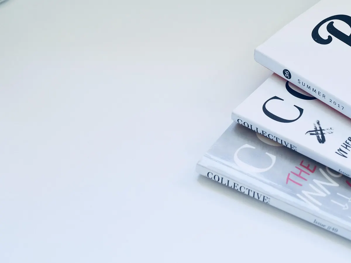
Most cover mishaps are decided long before anyone opens a design app. They begin in an email that reads "something striking, maybe with a silhouette" and end with a printer rejecting the file, or a reader squinting at a grey rectangle on a phone screen. Commissioning illustration is one of the few jobs in independent publishing where a small oversight in week one can eat a fortnight of your production schedule. None of the mistakes below are dramatic. All of them are common.
The good news is that almost every one of them is preventable with an hour of preparation and a slightly colder eye. Illustration is a problem-solving job, and illustrators are very good at it. What they cannot do is guess. Every gap you leave in your brief will be filled by an assumption, and assumptions are what you pay for twice.
A brief is not a mood. It is a set of constraints plus one clear idea. Illustrators are good at solving problems; they cannot solve a problem you haven't described, and "something atmospheric" will produce three atmospheric options, none of them yours.
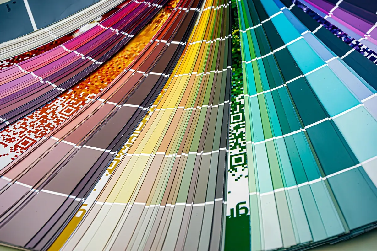
Do two hours of homework before you write it. Photograph the covers in your genre on a bookshop shelf, or open a retailer's category page, and note what readers already expect to see. You aren't copying; you're learning the visual grammar your audience reads without thinking. Thriller readers scan for darkness, tight type and a single figure. Romance readers scan for warm light, faces or the suggestion of them, and a script-adjacent font. Literary fiction is allowed to be strange, but it still has to be strange in a way that signals "literary" across a room.
Then cover the practical ground:
A brief of one page is usually enough. Two pages is fine if one of them is references. Three pages of adjectives is a warning sign that you are asking the illustrator to invent the book for you.
Sending a specific living illustrator's cover and writing "this style, please" is the most common way to start a commission badly. It puts the artist in an awkward position, it flirts with derivative work, and it rarely produces the result you actually wanted, because you were pointing at a finished piece rather than at the qualities inside it.
Describe the qualities instead. "A limited palette of bone, rust and deep green. Flat shapes rather than rendered detail. Hand-lettered type that feels slightly uneven. Lots of negative space above the figure." That is a set of instructions a professional can work with, and it will produce something original.
Mood boards are useful, but keep them honest. If eight of your ten images share a composition, say so, because that is the brief. If they contradict each other, the illustrator will pick two at random and you will be disappointed by both.
More of your sales will happen at 200 pixels tall, wedged between twenty competitors in a scrolling grid, than will ever happen in a physical shop. The thumbnail is not a compromise version of the cover; for most readers it is the cover.
Test it early. Export the sketch at thumbnail size, put it on your phone, and look at it next to the real covers in your category. Can you read the author name? Is there one focal point, or three competing ones? Does the title survive at 60 pixels? If two colours are doing the same job, remove one. If the type disappears into the background, the illustration is too busy or too light.
Tape a printout to a shelf at eye level. Step back three metres. That is the bookshop test, and it costs nothing.
These do not make the cover better, but they decide whether it prints at all.
Nothing here is dramatic either, but it is where small publishers get stung. Put the following in writing, even if it is a two-paragraph email both parties reply to with "agreed":
Describe the problem, not the solution. "The figure feels disconnected from the type, and the palette is reading colder than I imagined" is useful. "Move his arm and make it orange" is not, because it is your attempt at a fix, and the illustrator may have a better one.
Sleep on it before replying. Sketch disappointment is normal and almost never means the commission is going wrong; it usually means the brief was thinner than you thought. Then reply in one message, with all the notes, rather than five messages over two days.
The best cover commissions are boring to manage and exciting to look at. That is the whole aim: all the drama in the artwork, none of it in the schedule.
Photo: JessBaileyDesign / Pixabay
Ask ten slot players what RTP means and you'll get ten different answers, most of them wrong. The number gets thrown...
You've probably seen the term plastered across casino lobbies: high volatility . It sounds exciting. It sounds like...
November 02, 2026 - iGaming
October 24, 2026 - iGaming
Copyright © 2026 Tide Press. All Right Reserved.